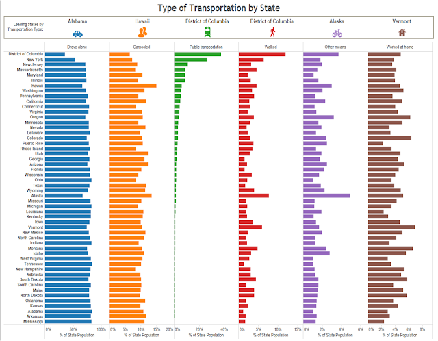
The first dashboard initially gives a high level overview of the different types of transportation and which state has the highest percentage of their population using that type. The bar charts below show each state and the percent of their population using the various forms of transportation. In the live version of the dashboard you can sort the columns or you can select a single state and see the distribution.
The second dashboard shows the same high level information at the top, but the map below shows different CBSAs colored by the average time it takes for an individual to get to work. Obviously, the bigger cities have a longer commute time (most likely due to traffic congestion). The size of the circles represent the number of people being considered in each city.

The third dashboard focuses on a single CBSA, selected using a filter on the right. This dashboard shows various ZCTAs (zip code like areas defined by the census bureau) and the number of people in that ZCTA that choose a certain type of mode of transportation, which is also selected using a filter on the right. In this case, you can see which areas tend to have a good number of people using public transportation.


